Contents
Increase Your Conversion Rates With Color
Do you want to learn how to increase conversion rates by choosing the right colors?
At this point, you may not have even thought about website color schemes that much.
However, did you know that using the correct colors leads to an 80% increase in brand recognition? That’s a massive increase. It basically means that color selection can actually make or break your blog.
You might ask yourself: Why?
Look:
Colors trigger a significant amount of emotions and influence our decision-making greatly. When we see colors, our brain communicates a signal to the rest of our body that affects our mood, well-being, awareness, and behavior.
The way we react to colors is a part of behavior psychology, which is a very complex scientific area. Although we aren’t experts in this field of study, we do recognize the connection between colors usage and behavior on a website.
There have been many studies done that aim to figure out what colors influence our perception and its effects. Furthermore, they have looked at the effectiveness of specific color usage, which in this case links back to colors and conversion rates.
We don’t want to go too much into depth on the scientific part, important as it is, however we don't want to over complicate things for you.
In this article we are going to keep it simple and show you how to choose your blogs color scheme.
So, are you using the right colors for your blog?
Let’s dive in and find out the answer to that question in this article!
Know Your Audience
Are most of your viewers women, or perhaps men?
Fact is: There are specific color groups that often women prefer, and vice-versa.
It starts at a very young age. For example, most young girls want their bedroom walls to be pink or red. While for guys, they are too “cool” for that, and they want black or blue walls.
According to Kissmetrics, women don’t like gray, orange and brown. Women tend to prefer blue, purple and green. If you, for example, have a blog about makeup or pregnant women, you know perfectly well what colors to use! You can mix it up between background, headers, tabs, page titles, etc.
In addition, according to the same source, men don’t like purple, orange and brown. Men tend to prefer blue, green and black. In case you’re running a blog about cars, football or your beard club – use one of these three favorite colors from men!
Did you notice the similarity between genders?
Both men and women like blue. Blue is has become a color that people trust. It's one of the most popular colors to use when building a website and with good reason. Large companies and big players in the online marketing industry use blue colors on their homepage!
Here are a few examples:
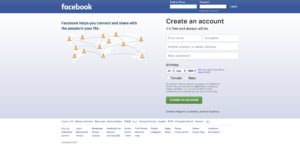
Facebook’s Homepage
Ahref’s Homepage

Dell’s Homepage

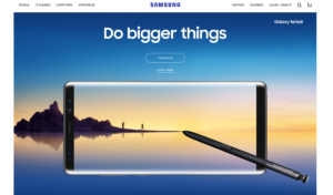
Samsung’s Homepage
And of course, here at 30DayBlogChallenge we also thought about what color would suit us best! We want you to trust us after all.
30 Day Blog Challenge Homepage

As you can see, blue is a go-to color for many businesses, large or small. Perhaps you can think of some websites you regularly visit and pay attention to their color usage.
What do Your Colors Actually Say?
Don't forget: Colors often speak louder than words!
Considering colors are interpreted differently by people due to cultural differences, some colors might stand for something different in one country compared to another. As mentioned before, you must understand your audience and figure out who you’re exactly targeting and adjust your website color scheme accordingly.
We’ve outlined a basic overview of a number of important colors and their general meaning.
Blue
So, what does the most popular color stand for?
Blue is often closely associated with trust, reliability, and safety. Also, blue is often an indication to a boy’s birth. It’s all all-around great color.
A word of caution for foodies: Blue is trusted in most circles. However, it’s strongly recommended not to use blue on your blog if you’re in the food niche. Blue is often referred to as overdue, bacteria, or poison in food related industries.
Red
In most Western countries, red stands for love, passion, and excitement. However, the red army of the former Soviet Union was fearsome and some people might connect red to bad memories or experiences.
In many Asian countries, red stands for celebration and joy. You often see it at weddings or other parties. However, some people connect red to the devil and argue it resembles fear and danger.
As you can see red is a tricky color and can mean meany different things, make sure you know your audience and where they are coming from.
Yellow
Yellow is often closely related to summertime, but also danger. For example, many road signs are yellow – danger up ahead. Yet, some studies state that yellow is the color of happiness for a lot of people and because it's the color of the sun.
As far a website color schemes go most sites don't use yellow as a warning, but as a color that is welcoming. It allows the viewer to know that your are friendly.
Yellow might be a good fit for a Call to Action button in combination with a fitting background color, such as black. It will stand out and these colors go good together.
Green
When you think about the color green, you think about the 4-leaf clover and good luck. Green also stands closest to our environment and protection of it, think about green energy etc.
Based on that, green is also associated with food, as it comes from nature.
So if your blog is related to the environment or food , you may want to consider green as the dominate color through out.
Black
In many situations, black represents luxury and elegance. High-end fashion designers, automotive industry, business life – all these examples usually associate black with luxury, timeless, and high-end.
Think about when you hear “The Man in Black”, you instantly think action yet classy and stylish. If this is what you are trying to achieve with your website, make black the main color you use.
White
There’s always the discussion whether white is a color, or not. In this case, it’s irrelevant.
Why?
Because white is a very strong design feature. Many large brands have created amazing designs with white as their main ‘color’. We’ve discussed that more in depth in recent our post on blog design.
Choose Your Perfect Website Color Scheme
Since we’ve now worked out the story behind colors and why we – men or women – are influenced differently and show unique behavior when confronted with colors, it’s time to put it into practice when deciding on website color schemes.
You might ask: How to choose color combinations for my blog or website?
In order to guide you through the process of choosing the best color scheme suitable for your audience, we created a helpful list with topics you should research or use as a checklist:
Topics to Help You Pick a Scheme
1. Emotions
What emotions do you want to trigger with your blog? Consider the personality of your readers and how you connect with them.
If your blog is about online security and privacy safety, you might want to consider choosing blue as your main color. Whereas we would recommend green with a foodie blog as it’s the color of nature.
2. Age
A well-known researcher published data on favorite and least favorite colors filtered by age group. Have a look at Joe Hallock’s research data below:
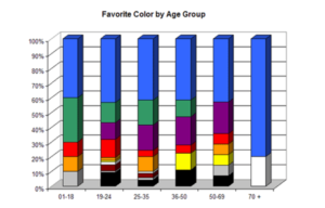
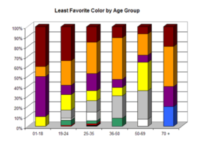
Blue and green are both leading colors regardless of age category. Yet there is a clear shift towards older people.
3. Personal Preference
Similar to when you plan to write new content – you research what your users are interested in and what they would read. You’re not writing content that you personally love and then hope some of your readers will enjoy reading it in return.
Same goes for choosing your blog’s color scheme. Don’t let your personal preferences hinder the decision-making process when it comes to colors. You may not even like the color, however, if your audience loves that color, you know what to do.
Be aware that your personal color preference will negatively affect your blog’s growth and conversion!
4. Color Distribution
Before you continue here, you are expected to have made a decision on the primary color of your blog.
We recommend choosing two other colors in addition to the primary color. A very common formula in the fashion industry is called the 60-30-10 color distribution. In other words, your primary color would cover about 60% of the blog followed by two other colors covering 30% and 10%.
Let’s take a look at some examples:
Neil Patel’s website uses gray as the primary color and orange as secondary color followed by black as an accent color.

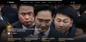
Forbes selected black as the primary color on their website. Understandably so, since white text reads easiest with a black background. The accent color is yellow as you can see a few small buttons or author names.
Slack chose a white background for their website. The text is a very dark blue, almost black, color and their accent color is a lighter blue. They highlighted the Call to Action button in the lighter blue – which is generally a great choice for your accent color.

5. Research Your Competitors
It’s always easy to have a quick look at your direct competitors or authority blogs in your niche.
Have a look at what they’re doing, are there similarities? How many colors are they using? This is also a decent indication of what their audience is most attracted to.
After you conduct some research, you can do two things:
- Create a blog with similar color pattern. If it's working for them, it will probably work for you.
- Implement complete opposite color patterns to create a unique look. If you think you can come up with a scheme that will work and is different, it may set you apart from the rest!
6. Multiple website color scheme options
Think about it like this.
Selecting one color scheme for your blog with three colors might not be the best solution here. What we recommend is creating a few color schemes tailored to your blog and then finally compare these schemes with each other.
Then pick the one you truly believe will work best!
Get Ready to Paint Your Blog!
Not literally, unless you love actual painting and have time for that after designing your blog!
Now that you understand the general psychology behind colors and how people interpret colors, what emotions are triggered, what behavior you can expect, and what that means to your audience. You should be ready to roll up your sleeves and get to work to create the best website color scheme for your blog.
Remember: We recommend following the same color distribution as the fashion industry does, don’t choose more than 3, maximum 4 colors when building your blog. Don’t be afraid to try multiple different website color schemes to find out what suits best.
At the end of the day, when your blog’s color scheme suits your audience properly, you keep your readers on your blog, they click through to other pages, spent more time reading your blog, increase trust in your brand and ultimately that will result in higher conversion rates.
What's Next?
We want to know what you think!
What combination of colors are you using on your blog? What are the best color combinations for website color schemes you have seen?
Or
Maybe you still aren't sure which color schemes will work best for you and you have a question for us.
Either way, leave your comments and questions below. The 30 Day Blog Challenge team loves hearing from you!
I use teal which is between blue and green. It is my favorite color and holds special significance to me as it is the color of Ovarian cancer awareness, something I had dealt with 9 years ago. My blog used to be almost all teal but now I use it more for accent and the font color for my sidebar.